Graphika
A social analytics platform (c. 2021 - 2025)
MVP (2021)
Context
Graphika is a social intelligence company that wanted to transform its service-based model into a SaaS product. I joined as Senior UX Designer to design the experience from the ground up — while the backend was being rebuilt from scratch, which meant launching with limited capabilities and expanding iteratively.
After about 3 months I became the sole designer, owning the process end-to-end: workshops, design processes, visual language, design system, and collaboration with product, engineering, and analyst teams.
Results
- ~20% reduction — in time clients spent contacting support for data requests.
- Weekly → daily — analyst insight delivery.
- ~90% daily active users — within the first month.
- Design as strategic function — established within the organization.
Research & discovery
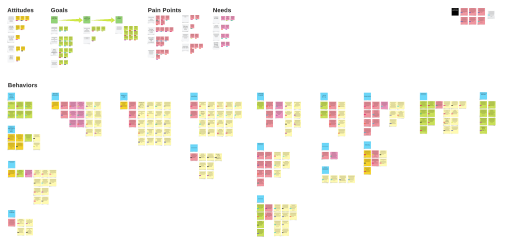
I reviewed prior research, synthesized workshops and interviews, and mapped insights into four themes that drove product and process decisions:
- Trust requires transparency — clients needed the complete picture of the data because they had to backup their insights to their leadership.
- Understanding the system was key to adoption — the platform had to provide the insights, but also teach network analysis.
- Two user archetypes — expert analysts vs. intelligence readers needed different depth without compromising either.
- Internal alignment mattered as much as UX — building alignment on product strategy across eng, product, and go-to-market teams was key to pushing past feature paralysis.
Design process
Working within significant technical constraints, I balanced ideal experience with engineering reality. I aligned teams first, then shipped fast.
Early sketches and explorations
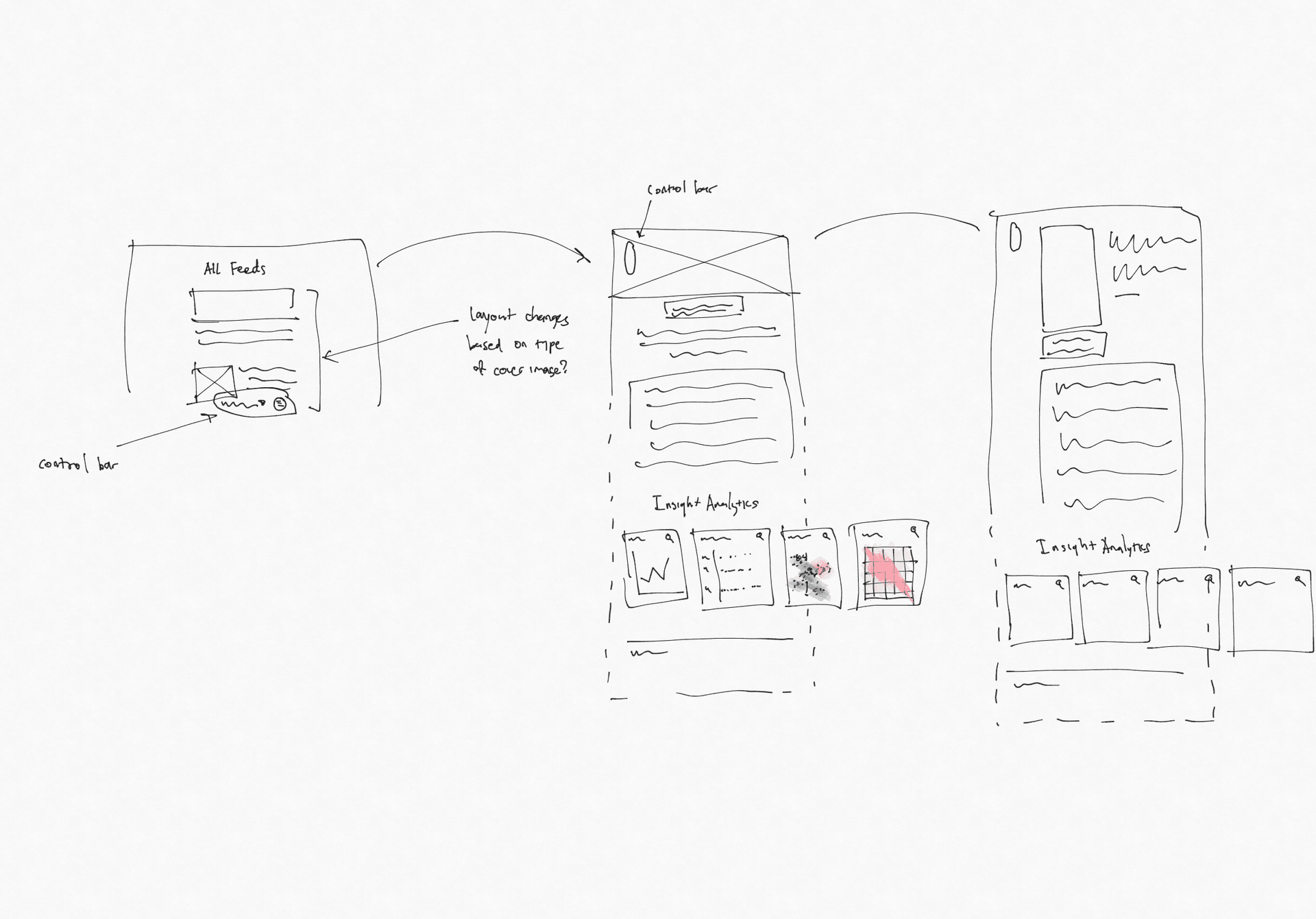
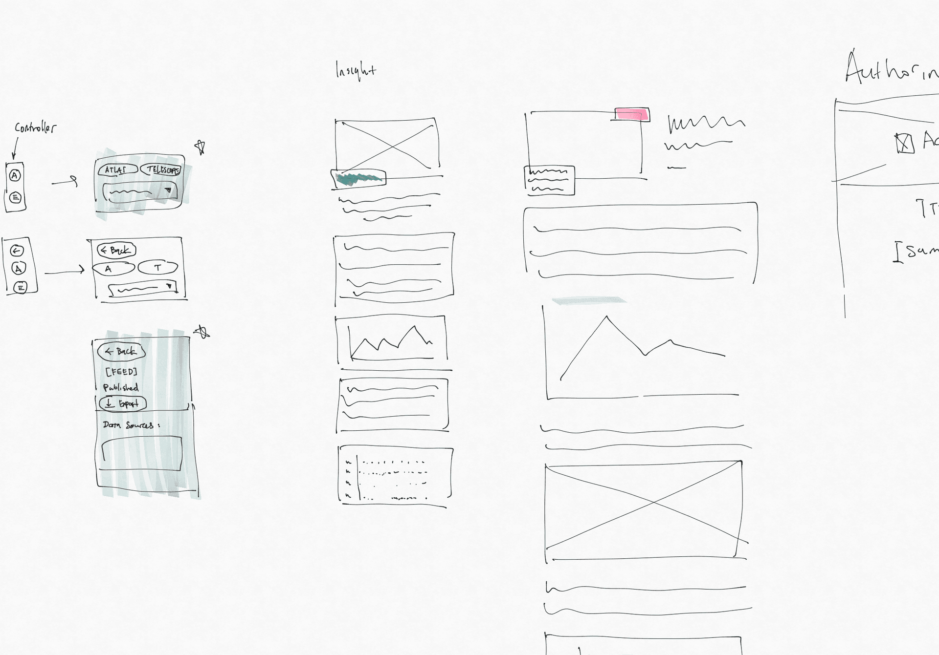
Sketches were co-creation exercises with engineering and go-to-market teams: mapping the ideal vs. current UI, aligning on product strategy, and setting constraints before visual exploration.
Sketches straight to high-fidelity
Once aligned, we skipped low-fidelity wireframes. The org wasn't used to working with them, so we iterated straight from high-fidelity designs.

Ship fast, learn constantly
We leveraged strong client relationships to rollout early, bugs and all. We kept detailed feedback notes from clients and internal users, and triaged against prior research artifacts to inform each design cycle.
Teaching network analysis
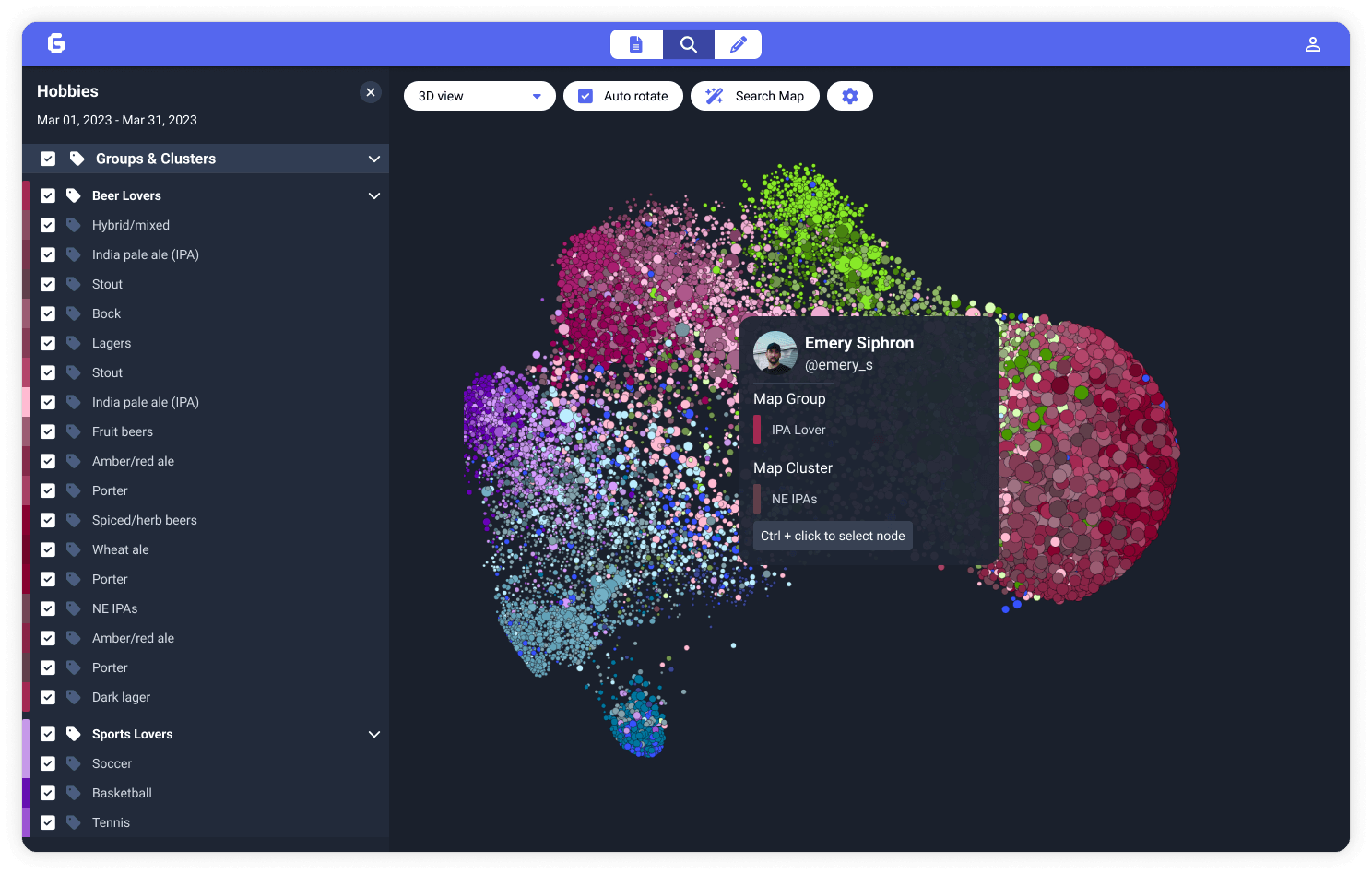
Clients kept asking which parts of the visualizations mattered and its meaning. I iteratively added context into the visualizations, leaning on client services for onboarding education, and later supplemented with timelines and stance views in the redesign.
Design tradeoffs
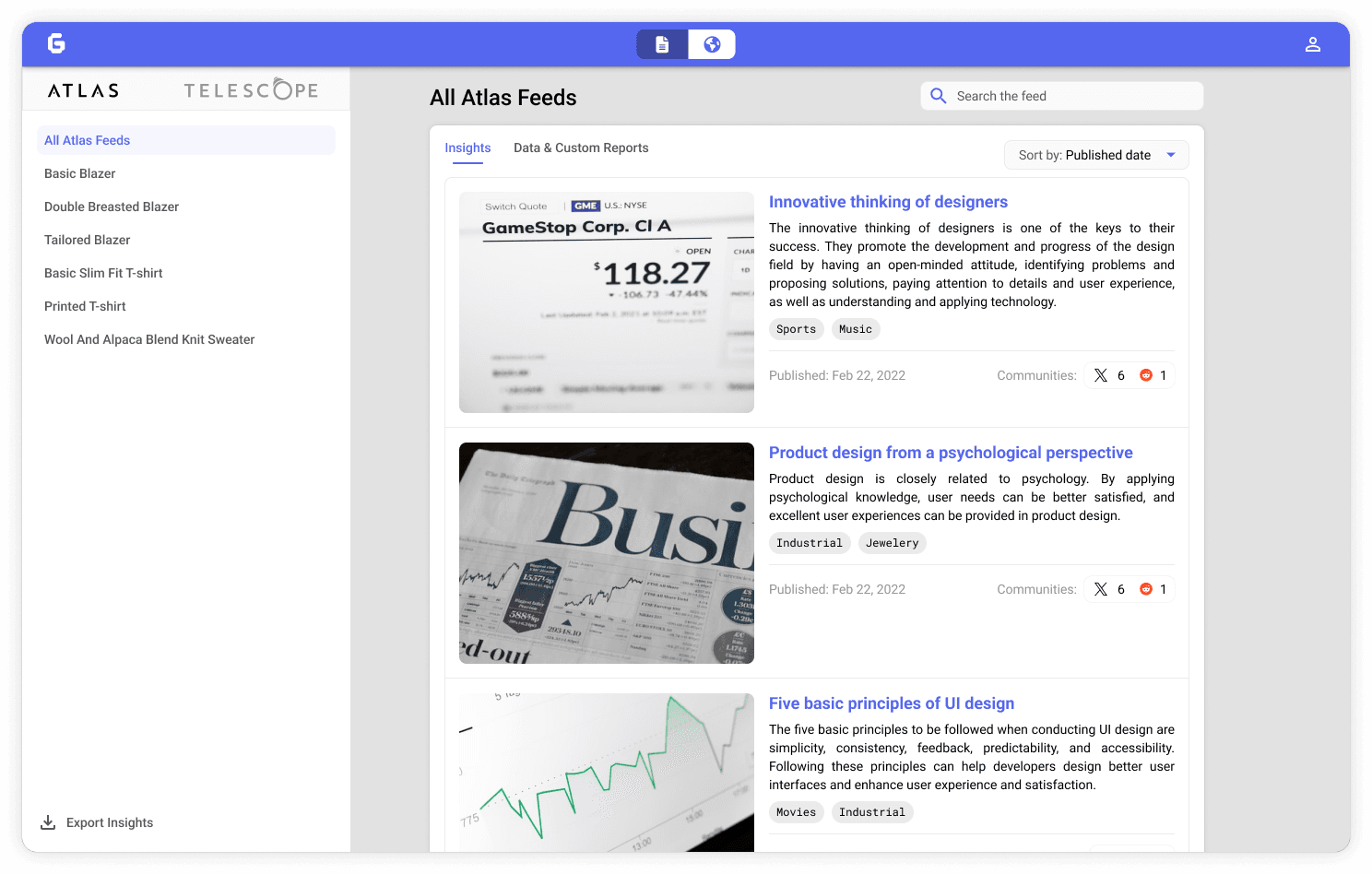
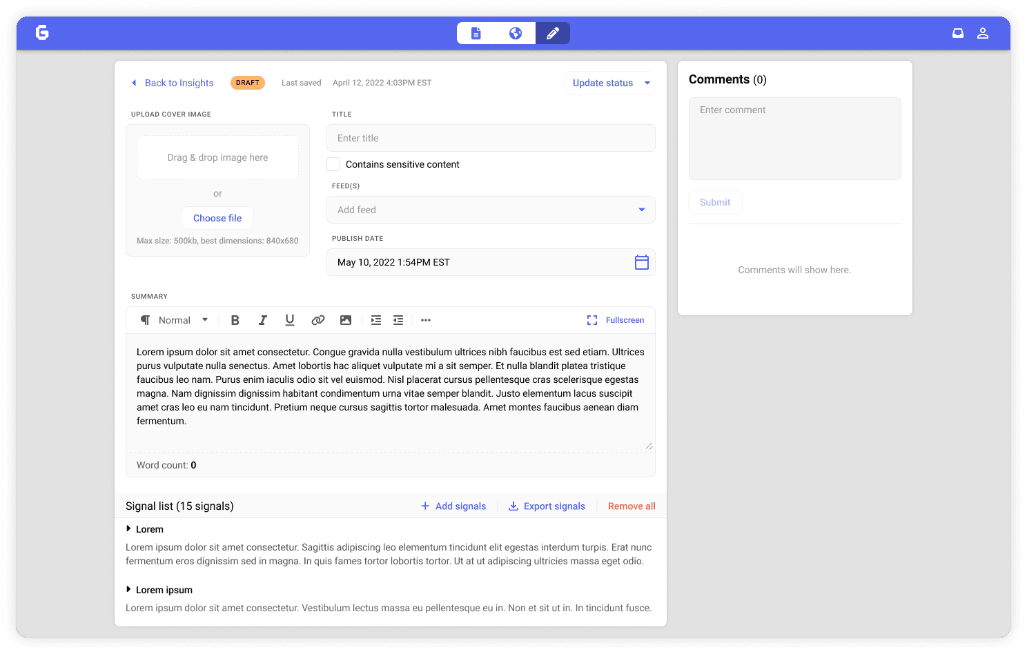
Clients needed post-level analysis behind insights, but we couldn't support that yet. Rather than delay launch, analysts uploaded CSVs of relevant posts and wrote the analysis inline. This bought engineering time until the API was ready later.
Defining the solution
Research pointed to three product spaces for v1: client-facing data access, analyst insight authoring, and visualizations that explained Graphika's technology. Separating them let us ship the client platform while building the analyst CMS in parallel, reduce cognitive load per role, and match the business model.
A multi-day design sprint mapped scenarios to features and produced a phased roadmap we referenced whenever scope debates resurfaced. In parallel I built a lightweight Figma system: components, viz patterns, and semantic naming. This kept our product & eng team aligned.
What I'd keep
The aggressive ship-fast, iterate-constantly approach. Launching early with a basic feed felt terrifying, but it created the momentum we needed to keep building and making decisions with real usage data.